Stop Chasing Opt-Ins: How to Build a Landing Page That Converts
Most landing pages are built to collect sign-ups. The best ones collect customers. Here's the structure that does it, top to bottom.
 Cover Image
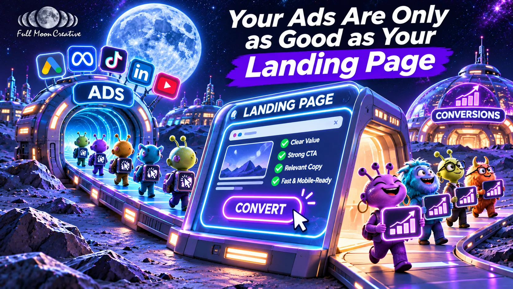
Quick answer: A landing page converts when it asks a qualified visitor to do one thing. Lead with a headline that promises an outcome, clarify it with a subheadline, and prove it with a hero image. Keep one clear call to action, ask only the questions that qualify a lead, answer the top three objections, and cut everything else.
A landing page has one job: turn the right visitor into a lead you actually want to call back. Most pages get that backwards. They chase a bigger opt-in number, and then sales spends the week chasing people who were never going to buy.
The fix isn't a prettier page. It's a quieter one, where every element earns its spot by moving a qualified visitor toward one action. Full Moon Creative has helped businesses and municipalities across Broward, Miami-Dade, and Palm Beach counties get found and chosen for 21+ years, and our digital team builds landing pages, ad campaigns, and the video that runs on them. Here's the structure we use, top to bottom.
What goes above the fold on a landing page?
Three elements: a headline that promises an outcome, a subheadline that clarifies it, and a hero image that proves it. They only work as a team.
The headline stops the scroll and promises an outcome
Lead with what the visitor gets, not what you do. "Commercial video production" is a category. "Video that books more consultations" is a result. If the right person doesn't stop and think "that's what I want," nothing below the headline gets read.
The subheadline clarifies the promise
Think of a YouTube video: the title hooks you, and the thumbnail fills in what the title left out. Your subheadline does that for your headline. It adds the who, the how, or the how fast.
The hero image proves it
Show the deliverable, or show the outcome. A finished video playing on a phone. A packed event room. A calendar full of booked calls. Skip the stock handshake. If the image could sit on anyone's website, it isn't proving anything.
A short, muted hero video can do the same job, as long as it's compressed and doesn't slow the page down.
What should a landing page call to action say?
A call to action should say two things: what the visitor gets and how they get it. "Get your quote by email." "Book a 15-minute discovery call." Nothing clever, and nothing vague like "Submit" or "Learn more."
Give the page one primary action. A second button competing for the click splits the visitor's attention between two decisions.
How many form fields should a landing page have?
As few as it takes to qualify a lead, which is usually four or five. Name, email, phone, company, and one question that separates buyers from browsers, such as budget range or project date.
Yes, every field costs you some opt-ins. That's the point. A short list of real prospects beats an inbox full of people who were never going to buy. Measure customers, not sign-ups.
More than five fields? Split the form into steps. Lead with the easy questions. Once someone has answered two, they're invested in finishing.
What goes below the fold?
Below the fold is where you answer the reasons people hesitate. Keep it to three pieces.
One line about your lead magnet
If you're offering a guide, checklist, or free consult, describe it in one line. That line answers the question every visitor is asking: why should I give you my email? "A one-page checklist for planning your next city event" beats "Download our guide."
Three bullets, built from objections
Pick the three biggest reasons people hesitate, ordered from most common to least. For a production company, that might look like:
- "Will this blow my budget?" A clear, line-item quote before any work starts.
- "Will it take forever?" A timeline agreed up front.
- "Do I have to manage five vendors?" One team, one point of contact.
Social proof, only when the offer needs it
A simple offer often doesn't need testimonials. A complex or high-trust one does: a municipal contract, a large live event, a long retainer. When you add it, put it under the bullets as a short testimonial, a row of recognizable client logos, or one number that matters.
What should you remove from a landing page?
Anything that isn't the promise, the proof, or the form. Drop the main navigation. Drop the footer links to your blog. Empty space is doing work here: it points the eye at the one thing you want visitors to do.
- Keep it short. The longer the page runs, the more people drift off before converting. Add length only when the offer needs explaining.
- Build for the phone first. A lot of your traffic, especially from social ads, lands on mobile. Test there before desktop.
- Make it fast. Compress every image and video. A page that stalls loses people before the headline loads.
- Cover the legal basics. Privacy policy, terms, and any consent language your industry requires. Small and in the footer, but present.
How do you decide what stays on a landing page?
Every element faces the same test: does it keep or raise the share of qualified visitors who opt in? If yes, it stays. If it lowers that number, or does nothing, it goes.
That includes the things you're attached to. The clever headline. The award badge. The second button. Run the test, ideally as an A/B test, and let the results decide.
Landing page checklist
| Element | Its job | Rule of thumb |
|---|---|---|
| Headline | Stop the scroll, promise an outcome | Name the result, not the service |
| Subheadline | Clarify the headline | Add the who, the how, or the how fast |
| Hero image or video | Prove the promise | Show the deliverable or the outcome |
| Call to action | Say what they get and how | One primary action, never "Submit" |
| Form | Qualify the lead | 4–5 fields; more than 5, go multi-step |
| Lead-magnet line | Answer "why give my email?" | One line |
| Objection bullets | Remove hesitation | Three, most common first |
| Social proof | Build trust | Only for complex or high-trust offers |
| Legal | Keep you compliant | Footer, small, present |
| Everything else | None | Cut it unless it raises qualified opt-ins |
How does Full Moon Creative build landing pages?
We build the landing page, the campaign that sends traffic to it, and the video that runs on it as one project, then measure it on customers, not clicks. Pages are built for Core Web Vitals, schema, and conversion from day one, and the same in-house team produces the hero video and photography.
- Discovery call. We define what winning looks like for your business, such as booked consultations or signed contracts, before talking about layout.
- Audit. Your current pages, conversion tracking, and the ads pointing at them, plus a look at competitors in your market.
- Build. One promise, one action, and form questions that qualify the lead, with conversion tracking wired to your CRM so spend traces to closed deals.
- Test and report. Monthly reporting against pipeline and ROI. We keep what raises qualified opt-ins and cut what doesn't.
Where should you start?
Pull up your highest-traffic landing page and run it against the checklist above. Start with the headline and the form, since every visitor sees the first and every lead passes through the second.
If you'd rather have it built for you, book a discovery call. We'll define what winning looks like for your business, then build the page, the campaign, and the content to get there. Discovery is free, and we reply within one business day.